With the release of the 2025 World Happiness Report, the focus has been on the top countries in the rankings. They don’t mention trends except for highlighting “In general, the western industrial countries are now less happy than they were between 2005 and 2010.”
But we care about world happiness. So, we think it’s worth stepping back and seeing how the world as a whole is doing.
For details about the data we use for each graph, please see the “data note” at the end of this post.
1. World happiness is recovering and smaller countries are doing better
In 2024, the average happiness across countries is a score of 5.5 (on a 0 to 10 scale). However, this is a simple average that treats each country as one data point. So, a country with a small population has as much impact on the global average as a country with a large population. Iceland (population = 400k) has as much influence as India (population = 1.4 billion).
Instead, an average weighted by population size gives us a more accurate and slightly lower assessment (5.3 points) of global happiness. The implication is that smaller countries tend to be happier than larger ones.
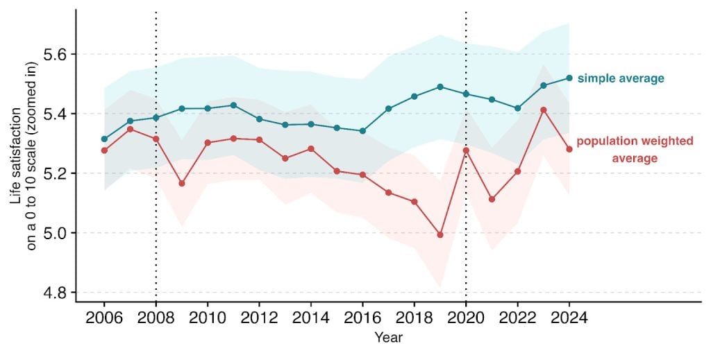
Overall, things seem positive. The world has recovered to its pre-COVID (and almost pre-2008 crash) levels of happiness.

Overall, things seem positive. The world has recovered to its pre-COVID (and almost pre-2008 crash) levels of happiness.
2. Europe and Latin America have the most growth in happiness
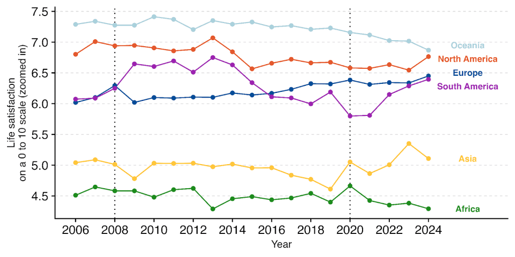
The recovery in world happiness appears driven by the recent gains in North America, Europe, South America and Asia.
Oceania and Africa have declined in happiness over the nearly 20 years of world happiness data.
Europe stands out as the only region that’s made steady progress over the last two decades. Latin America, like Europe, is also now nearly 0.5 points happier than it was at the start of the period. But it had a bumpy ride and is still below its peak from 2009 to 2014.
3. Most of the largest countries are less happy than in 2006
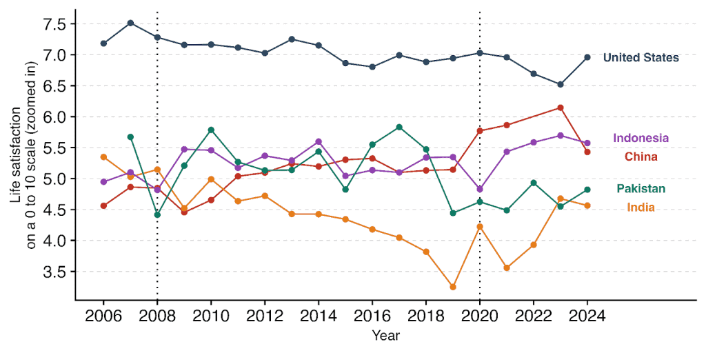
If we look at the top 5 most populous countries (which contain nearly ~50% of the world’s population!), we can observe a few interesting trajectories.
- The USA (-0.25), Pakistan (-0.75), and India (-0.75) are all less happy than they were when Gallup started collecting data.
- Indonesia (+0.5) and China (+1.0) are happier now than they were in 2006.
- The United States, while rumoured to be at its lowest ebb in happiness, has regained a fair bit of happiness – nearly 0.5 points since its nadir last year. It’s low ranking in the world happiness report is because they average over the last three years. But it’s still below its peak of 7.5 in the heady days of 2007.
- China and India (the most populous countries on earth) seem to be behind the post COVID bump in global happiness. However, China had a large drop in 2024 almost erasing its recent gains.
4. It’s not just the size of GDP, it’s how you use it
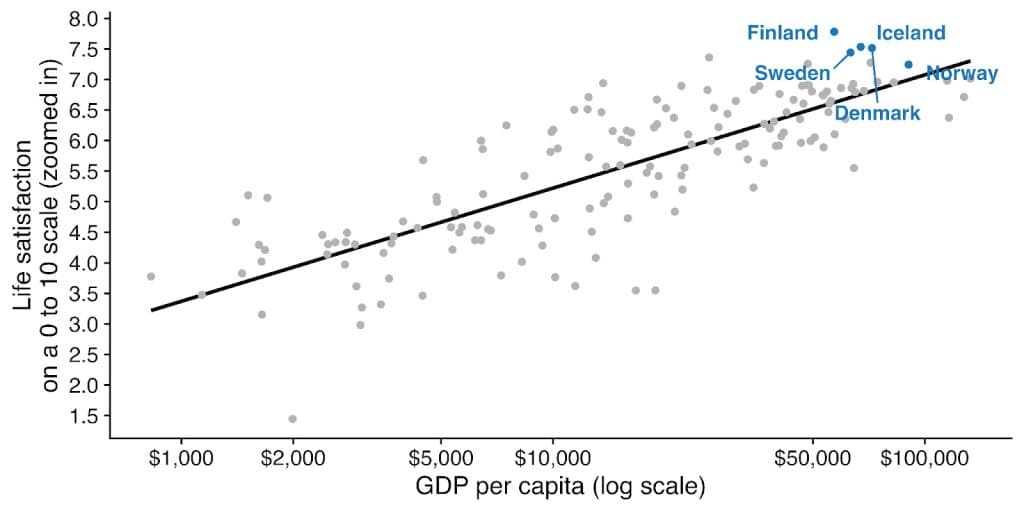
Which countries do better or worse than GDP predicts?
Richer countries are happier. However, we know from the Easterlin Paradox that, surprisingly, economic growth over time does not seem related to (much) gain in happiness.
In this spirit, we would like to share some lessons some country groups can teach us about happiness, beyond GDP. These are countries with happiness better and worse than income would predict.
Nordics: The secret of the happiness super powers
The Nordics’ preeminence in satisfaction seems reasonable and unsurprising. Sorry, there’s no secret here. They tick almost every box of prosperity, security, social safety, high trust, and well functioning accountable governments.
Latin America: Wellbeing is cheap from family and friends
Despite insecurity, low trust, and middling incomes, many Latin American countries are more satisfied than GDP alone would predict.
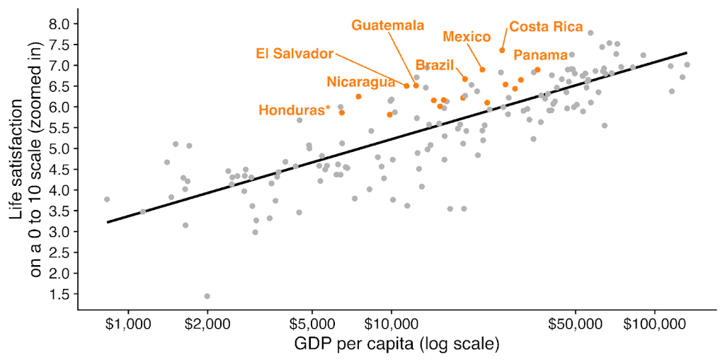
If you’ve spent any time in Latin America (or the Spanish speaking world more broadly), you might have a few guesses on why. Some are right, some don’t seem supported!
- Does Latin America have a better work life balance relationship? Sort of. While some Latin American countries seem to work less than you’d expect based on their GDP, many are in line with expectations. So we need another explanation.
- Our fellow contributors to the World Happiness Report, Mariana Rojas and colleagues, have made the case that driving Latin America’s happiness exceptionalism is a widespread emphasis on deep rich social (2018 report) and familial connections (2025 report).
Middle East and North Africa: A miserable mystery
The flip side of Latin America in terms of regional happiness is the Middle East and North Africa (with Israel excluded). There, most countries tend to be less happy than income would typically predict.
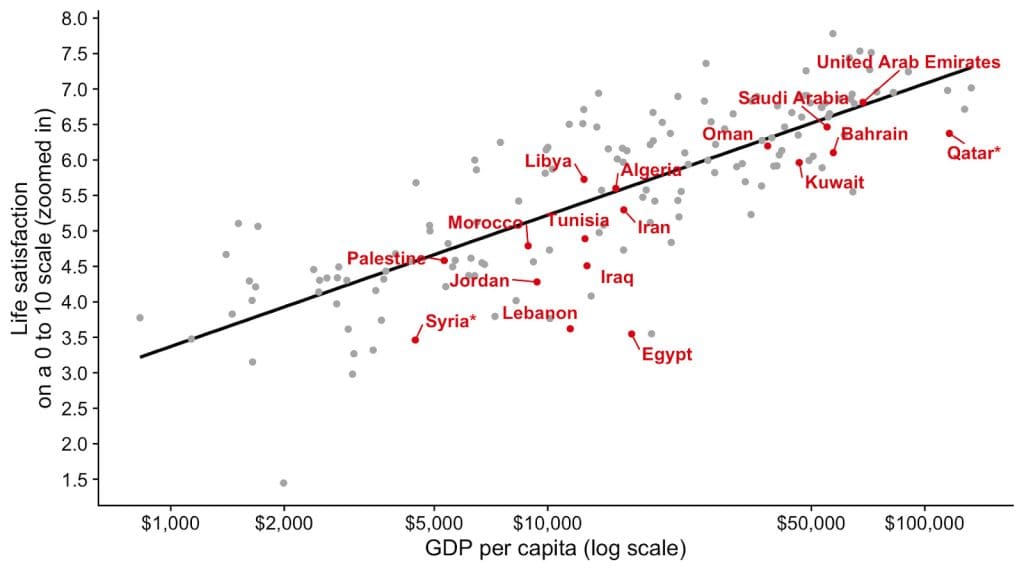
The usual suspects are widespread autocracy across the region, low trust, corruption, and conflict. But all these factors (except autocracy) are also present to some extent in Latin America.
A paper in 2016 by Arampatzi and colleagues pursued this question and they concluded that the sources of the region’s lower happiness is “dissatisfaction with the standard of living, poor labor market conditions, and corruption.” The unemployment rates at least do appear exceptionally high, which may explain some of the puzzle!
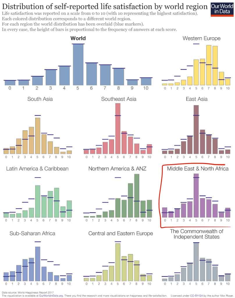
Another potential explanation may be stranger. People in the region regularly respond to wellbeing questions in an unusual way. Look at this graph from Our World in Data. Individuals from the Middle East and North Africa appear unusually likely to choose the 0, 5 and 10 responses.
5. Happiness shouldn’t come at a cost to others
In a previous blog post we discussed a theme of the world happiness report: how happy countries are often more generous (and thus better for the wellbeing of other countries). Here, we examine the darker side of this question: are there cases where a nation’s happiness comes at the expense of others?
If one country’s satisfaction is built on the suffering of another, its model is hardly worth emulating. Happiness, like other measures of progress, can sometimes obscure the external costs imposed on others. For example, GDP can go up during war (e.g., despite sanctions, as has been the case with Russia).
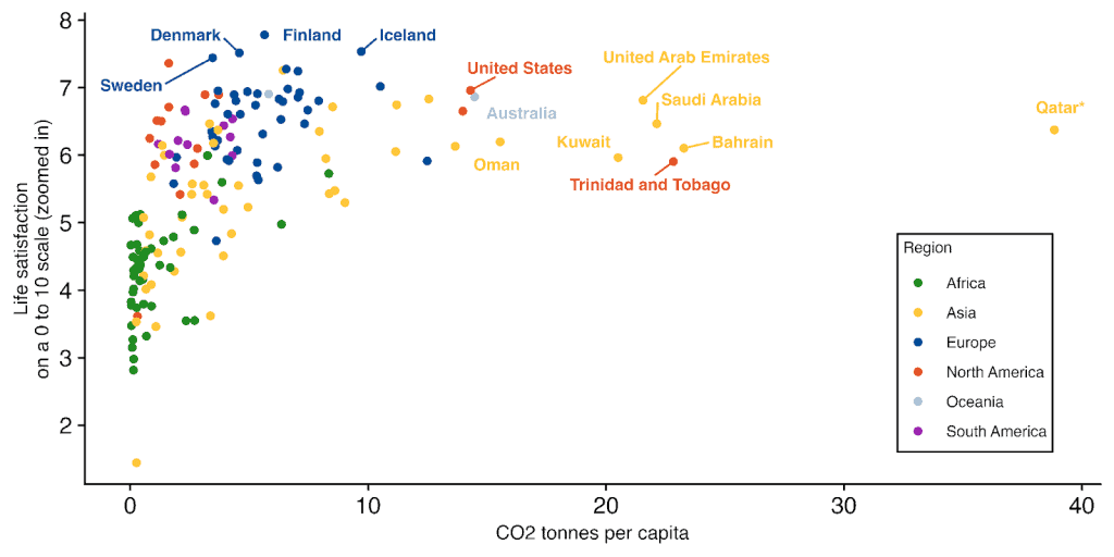
Carbon-fuelled economies live on borrowed happiness
Many richer countries might be promoting their happiness with lifestyles that cost the environment (and other people) dearly. The graph below shows that this might well be the case for rich Arab countries, Australia, and the US.
It also seems that, while not without pollution, the top nordic countries are able to attain higher levels of happiness, with considerably lower carbon footprints and with no clear sacrifice to their incomes.
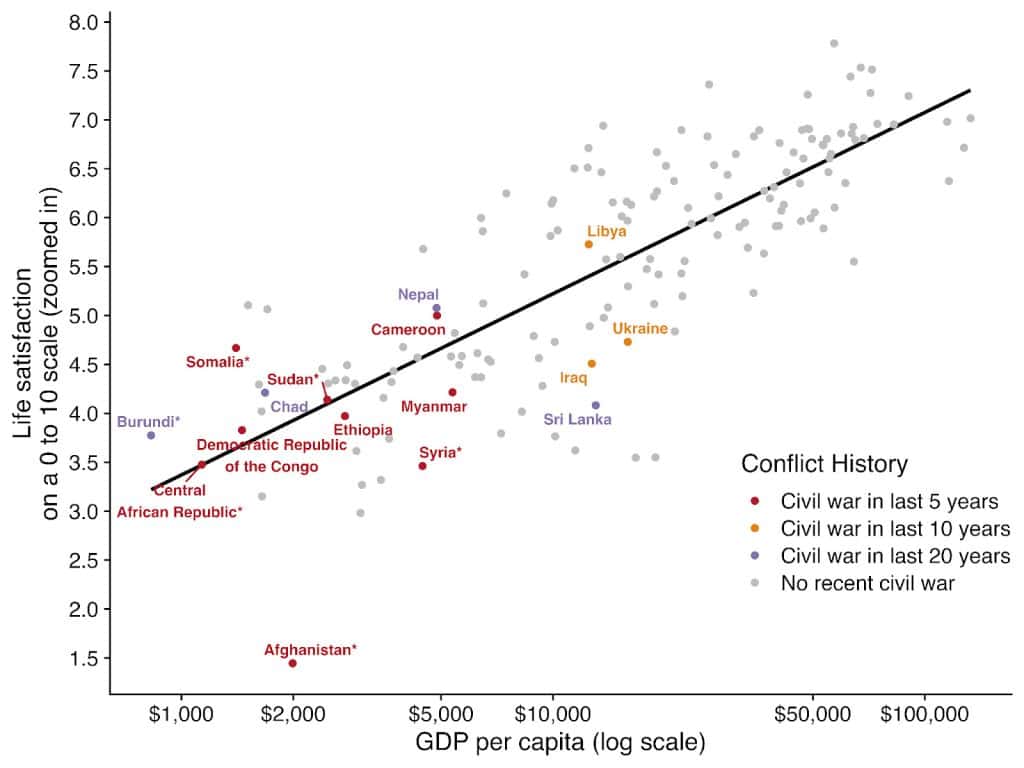
Civil war is hell
Internal conflict causes enormous amounts of misery. Many of the least happy countries have experienced internal conflict sometime in their recent past. Afghanistan is the clearest case, along with South Sudan, Democratic Republic of Congo, Syria, Central African Republic, Yemen, and Ethiopia’s recent conflicts. The story could be that miserable countries have less to lose from burning the house down, as well as the obvious story that it’s terrible to live in ruins.
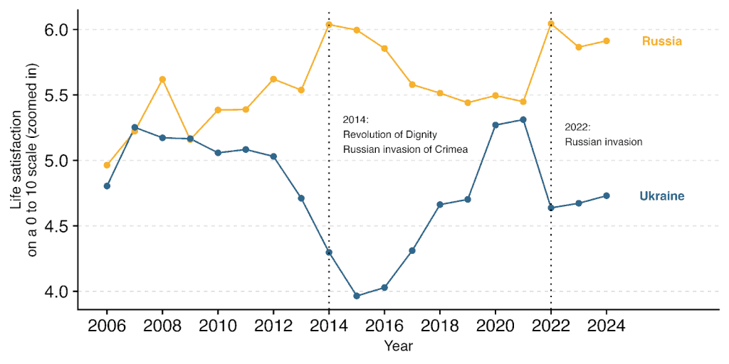
Interstate War and (un)happiness
Strikingly, the happiness scores of Ukraine and Russia move in opposite directions. Naively, Russian aggression seems to be related to higher Russian satisfaction, and this comes at the direct expense of its neighboring country. This, clearly, is not a happiness worth emulating.
Many are surprised by the high ranking of Israel in the World Happiness Report rankings. This is perhaps especially the case because happiness is deeply tied to prosociality and altruism. But as we showed in another blog post, this is probably much truer within than between countries. What’s important for a country’s happiness is an internal sense of cohesion. And as much as civil wars can divide a country for decades (or more), interstate wars can unite nations.
The pattern for Israel and surrounding countries is not as dramatic as with Russia and Ukraine. Although, Israel and Palestine (where the overwhelming share of the fighting took place) are seeing opposite patterns from 2023-2024 – but for Israel this may just be regression to the mean. The largest shifts we can observe are in Syria, which descended into civil war in 2011, and Lebanon, whose GDP has shrank by 30% during the course of an economic and political crisis starting in 2019.
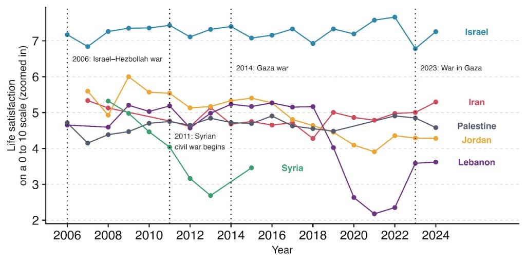
In war, it seems reasonable to expect that the country where most of the fighting is taking place to have their wellbeing be more affected – especially if they end up losing the war.
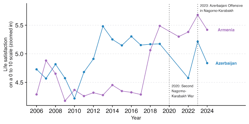
An exception to this is Armenia which lost two wars to Azerbaijan in recent years. Azerbaijan has reaped no spoils of wellbeing. Indeed, the clearest story here seems to be that Armenia’s rise in wellbeing coincided with the success of democratic reforms following a peaceful revolution. Losing the wars was likely not something that enriched the lives of Armenians, but in this case a transition to a more democratic government seemed more important.
6. You can improve world happiness
All these global trends might make us feel like there’s not much we can do about the happiness of the world. And that’s probably right. We can’t make the world happier overnight.
But we can probably do much more than we expected for world happiness. We’ve written a whole chapter for the World Happiness Report about the most cost-effective charities to improve global happiness. The best charities in our sample are hundreds of times better at increasing happiness per dollar than others.
And who knows, a million small changes is how the world improves.
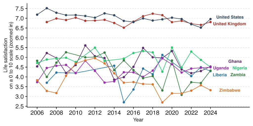
If you are reading this, chances are that you are in countries that are much richer and happier than the countries in which our recommended charities operate. You can see how these countries bunch up far below the US and the UK (the countries where most of our team is from).
So consider reading our chapter, donating to cost-effective charities, signing up to our newsletter for more information like this in the future, and sharing our work!
Data note:
The World Happiness Report averages the scores from the last three years. Instead, we present the 2024 data as is because this allows for an interesting and direct presentation of data over time.
This does mean that some countries do not have data for every year (e.g., 2024 data is missing for Afghanistan and Luxembourg, among others). Except for the individual country trends, we impute data from the latest available year.
Countries with stars next to their names in general graphs are countries for which the latest data is not 2024:
- Afghanistan’s last data was in 2023.
- Burundi’s last data was in 2018.
- The Central African Republic’s last data was in 2017.
- Honduras’ last data was in 2023.
- Qatar’s last data was in 2015.
- Somalia’s last data was in 2016.
- Sudan’s last data was in 2014.
- Syria’s last data was in 2015.
For population data, we use data from the UN (UNPD, 2024). The latest observed data is 2023, so the 2024 data is a projection by the UN. We removed Somaliland and North Cyprus from the analysis because the UN did not provide population data.
Trends for each region of the world are weighted by population.
The GDP data is from 2023 (the World Bank has not yet released 2024 data). We accessed the GDP data from Our World in Data.
The CO2 data is from 2023. It represents CO2 tonnes per capita for fuel and industry, not including land use. We accessed the CO2 data from Our World in Data.
We manually classified civil wars, with an eye towards those that were higher intensity (1,000+ killed in action). We might have missed some, so feel free to point out any gaps.